Again this fits in with the rock genre of dark colours. This logo will be seen as very attractive within the genre. The text is also cracked relating to the distortion of the genre and dark themes.
Thursday, 19 December 2013
Fall Line Logo
Again this fits in with the rock genre of dark colours. This logo will be seen as very attractive within the genre. The text is also cracked relating to the distortion of the genre and dark themes.
Wednesday, 18 December 2013
Website Review
To help create our website we will be reviewing the website of the artist whose song we will be using, Linkin Park, to help with our research.

This website has multiple tabs at the top, which lead to the pages you expect to see on an artist's website such as tour information, photos and and music.
In my opinion, I don't think this websites stands out or has it's own characteristic feel. It uses basic colours and has no stand out features that wouldn't be seen on any other generic band's website.
Linkin Park have changed their sound with every recent release which have put off many of the older fans, and this website is telling that they are targeting new audiences who have became interested in the band in the last few years which is more late teens and young adults with their more electronically-focused sound. This is in contrast to their targeting of a younger audience when nu-metal was their primary genre in the early 2000s. The plain layout and colours would appeal to the mature new audience the band as, and is most likely a stark contrast to how the website would have looked in 2001.
This website would appeal fairly well to these fans of the band with it's various elements such as photos and music, as this would be what they can find use from on the site.
In conclusion, applying this to our own website. One positive aspect of this site I found is it has kept a consistent house style throughout all the pages, which we aim to replicate with our own website as failing to do so would look more unproffessional. However, this is also an indicator that we should aim to make our site stand out more and not be looked at as generic like Linkin Park's has, while also retaining the various features you would find on most band websites such as tour information, news photos etc.
Sunday, 15 December 2013
Questionnaire Results

 For the metal/rock genre most people expect dark clothing in the music video. This will heavily influence the fashion we use for our video. It was a common suggestion to have dark themes for a rock album cover and something scary so we will use this information when making our own.
To the right are the results of our questionnaire put into graphs. We will use these results to base some of our decision making about the project based on audiences expectations.


Friday, 13 December 2013
Prop List
This is a list of the various props we will need
Camera -
We will obviously be using a camera to film the music video, with one of a professional standard for the performance elements of the video and the photo shoot and a smaller digital camera to carry around easily and film the narrative parts and also some additional things.

Instruments -
We will need instruments to be used in the performance scenes of the video, which are a guitar, drums, microphone and a bass guitar. The actors don't necessarily need any musical talent, but fast editing can mask this and still make it look realistic.

Mic stand -
We will need a mic stand for our vocalist, even if it won't be used in all performance scenes.

Clothing -
To fit in with the style and conventions of our genre we'll have specific clothes for the band members in both the music video and photo shoot
Treatment
 Linkin Park is an American rock band from California. They are a very successful band rising to international fame with their debut album Hybrid Theory. This album has been certified Diamond and Multi Platinum in other countries. Over the years they have adopted many different genres and styles which include, alternative rock, nu metal, rap rock and rap metal. Due to their diversity they have formed many collaborations with other successful artists, perhaps most notably with rapper JAY Z. With whom they produced an EP, Collision Course.
Despite their success and worldwide fame they did originally have struggles in gaining a record deal. The band was originally formed in 1996 under the name, Xero. The band at this time consisted of 3 high school friends, Mike Shinoda, Rob Bourdon and Brad Delson. After recruiting a few more members they changed their name to Hybrid Theory(where their debut album title came from), when agreeing to recruit vocalist, Chester Bennington. Again the band decided to change the name after still struggling to find a record deal. They originally wanted to change the name to Lincoln Park but had to use Linkin Park to acquire the web domain, linkinpark.com. Eventually they signed a deal with Warner Bros.
The song we are using, Papercut, is of the genre nu metal and rap metal. Considering this for our music video we will be taking the heavy rock/metal feel when filming. We will be using dark themes and have a general dark nature to the video.
 |
| Colour scheme example of black and white |
Linkin Park follow a very dark colour scheme. They use blacks, whites and purples and blues. This will help us when we do our logo and website. We will follow a similar colour scheme to fit in with the genre.
Wednesday, 11 December 2013
Record Label
Linkin Park
Linkin Park are part of Warner Bros. Records, who are one of the biggest record labels in the world. It is part of Warner Music Group, who are the third biggest major music companies worldwide. They have artists from a wide range of genres signed to them such as trance DJ Paul Oakenfold, social conscious rapper Talib Kweli and hard rock band Disturbed.
Linkin Park signed a deal with Warner Bros after years of working independently, and released their successful first album Hybrid Theory on it a year later.
Our band

We have looked at a variety of record labels for Fall Line to be a part of, such as Epic Records, Universal and Sony. We ultimately decided on Roadrunner Records, who are a subsidiary of Warner Music Group. Founded in 1980, these have largely had a focus on signing metal and hard rock acts. They have many artists similar to Linkin Park in their roster, such as popular ensemble Slipknot, who also have nu-metal influences in their earlier work like Linkin Park, as well as lesser known more contemporary acts like Hail the Villain.
Linkin Park are part of Warner Bros. Records, who are one of the biggest record labels in the world. It is part of Warner Music Group, who are the third biggest major music companies worldwide. They have artists from a wide range of genres signed to them such as trance DJ Paul Oakenfold, social conscious rapper Talib Kweli and hard rock band Disturbed.
Linkin Park signed a deal with Warner Bros after years of working independently, and released their successful first album Hybrid Theory on it a year later.
Our band
We have looked at a variety of record labels for Fall Line to be a part of, such as Epic Records, Universal and Sony. We ultimately decided on Roadrunner Records, who are a subsidiary of Warner Music Group. Founded in 1980, these have largely had a focus on signing metal and hard rock acts. They have many artists similar to Linkin Park in their roster, such as popular ensemble Slipknot, who also have nu-metal influences in their earlier work like Linkin Park, as well as lesser known more contemporary acts like Hail the Villain.
Friday, 6 December 2013
Facebook Page


To go with our Twitter Page we also created a Facebook page to promote our band, Fall Line.
These screenshots track the process of making the Facebook page. In the process of creating the page we included a link to our Twitter and will eventually link the bands website.
This is when the page was finally set up, when we have created our logo, we will add it to the profile picture of the band. In the description, we put a little background on the band and told the fans to 'get ready.'

This is the link to our Facebook page. https://www.facebook.com/FallLineBand
Thursday, 5 December 2013
Fashion
We are choosing our fashion we have decided to go with traditional rock style clothing. This is just lots of dark colours, such as black and grey. This fits in with the dark theme of the song we are doing and the genre itself. Our fashion will also emulate the style of Avenged Sevenfold. They almost always wear all black so this is another reason we have picked this particular style of clothing.

Avenged Sevenfold also like to pay homage to their idols and their musical inspirations by wearing their band merchandise. In our video we will also do this by wearing Avenged Sevenfold merchandise.
We also like the style of Linkin Park. Again Linkin Park use a lot of blacks but also wear smart clothing which we may feature in our video as well. Linkin Park also like to wear leather jackets which we will do as well.

Wednesday, 4 December 2013
Musical Influences

To influence our music video, we are primarily using the original source material in Linkin Park. The music videos released for their first two albums all had similar dark themes along with the lyrical content of the songs themselves, which we are using in the narrative for our video.
Thankfully, both of us are both fans of Linkin Park's earlier material so should be able to apply this accurately to our video.
Another band we are taking influence from is the band Avenged Sevenfold. Their music video for 'Nightmare' has provided us with inspiration for how the performance scenes of our video will look and the dark lighting. We are both big fans of this band, and their style and general qualities greatly influence our fictional band on a more stylistic approach than Linkin Park do through their music.


Tuesday, 3 December 2013
Facebook Analysis
Facebook has risen to the 2nd most visited website in the world in recent years, with the ability to socialise with friends through status updates and noting your interests in media being a significant feature through pages. It has now became the norm for musicians, bands and celebrities alike to have their own page promoting them regardless of genre or target audience, as the more likes the page has the more people you will reach out to. Even people who don't like the page will see the content through their Facebook friends sharing it, and advertising the band even further and forming new opportunities to gain more fans.
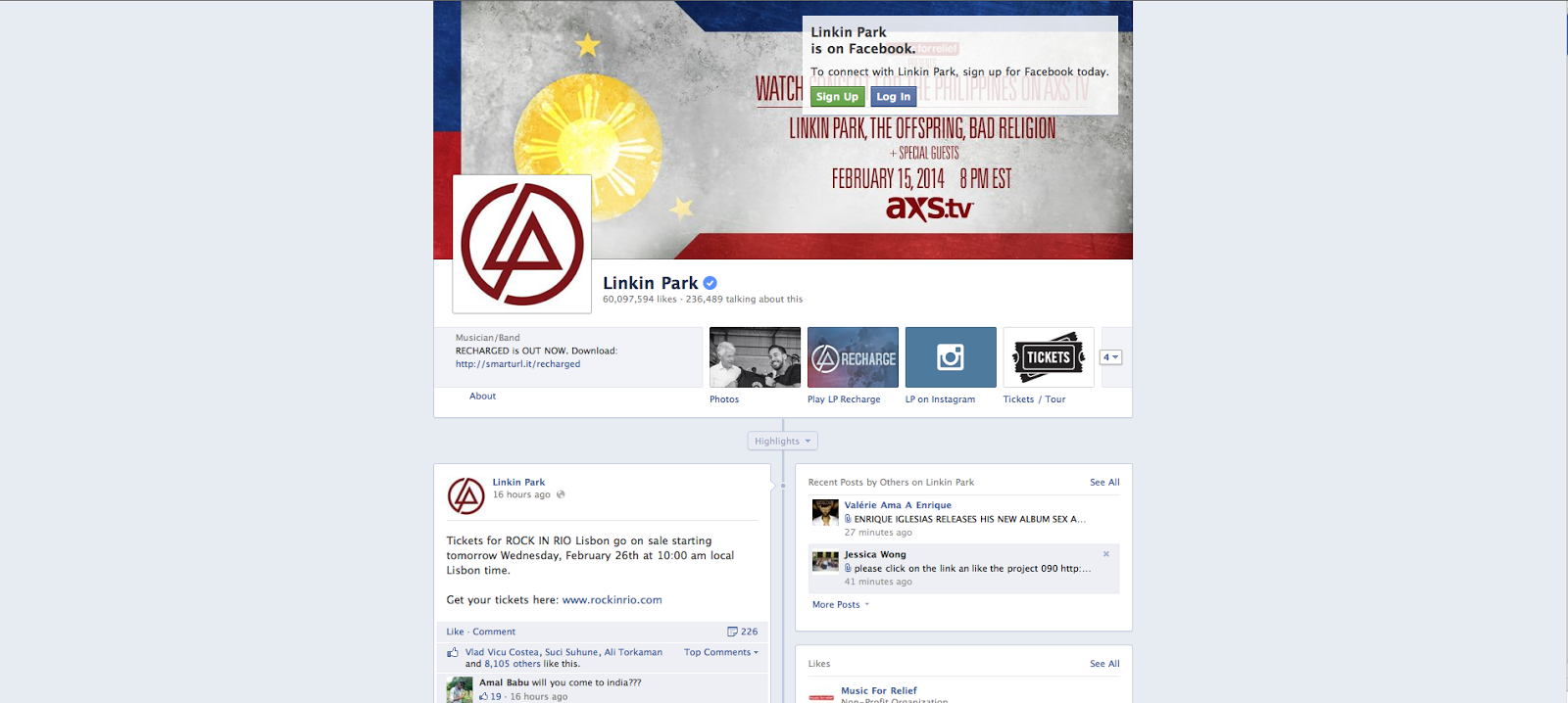
Linkin Park have too got their own Facebook page, which is operated similarly to their Twitter account.
 They have 60 million likes, which is significantly more people that are viewing their content than the Twitter account which has just under 4 million followers.
They post often, promoting their latest music releases as well as shows/media appearances. They also post about their latest charity endeavours, which are likely to please fans which is evidence of them succeeded more with promoting their band through this Facebook account than the Twitter account.
In regards to the style, Facebook pages have a house style and the same blue background for all their pages. which makes the cover photo the central area for bands to express their style. Linkin Park have used the same picture promoting their charity event performance that their Twitter account uses, while their profile picture is just the logo on a white background. While limited this is obviously the most they can do with the design, so our Facebook page will be similar in having a simple band logo as our profile picture and something eye catching for the cover photo. They also have the expected parts of a musician's Facebook page such as photos/information.
Overall I think this is an acceptable Facebook page from Linkin Park, with its easier layout and links to their other social media sits as well as where to buy their album standing out ahead of their Twitter account. Our band will follow a similar style and take inspiration from this for content and style for our own Facebook page.
Subscribe to:
Comments (Atom)